From Legacy Debt
to Unified Systems
In 2022, I joined a design environment where product releases were managed via static PowerPoint decks. My first priority was replacing this manual process with a professional Figma infrastructure — which I achieved within the first year.
As the Mobile business scaled, the challenge shifted from simply "having a library" to building a sophisticated, multi-variant ecosystem capable of handling increasingly complex buyflows and self-care journeys.
By 2025, the goal evolved again: rebuilding the variable system from the ground up — not patching it, but replacing it with a three-tier token architecture engineered for multi-LOB scalability, dark mode readiness, and AI-assisted component generation. Simultaneously, my scope expanded to Fixed Internet, requiring a single system to serve three separate business units — Fixed, Mobile, and B2B — without duplication.
Five Problems.
Five Solutions.
Transitioning a legacy enterprise from fragmented design decks to a unified, production-ready token system required navigating deep technical debt, cultural resistance, and architectural problems that didn't reveal themselves until the system needed to scale.
When I started, there were virtually no existing Figma designs for the live site. Creating a working foundation meant manually replicating live site designs to establish a baseline from scratch.
I treated the replication as an audit opportunity. While rebuilding, I identified inconsistencies and used high-level training sessions to establish Figma as the "Single Source of Truth" — encouraging cross-functional collaboration through interactive commenting and live reviews.
In Phase 2, the library and page designs lived in a single file. As component count grew, the file became unstable for fast-turnover monthly releases. Designer performance suffered, and version control was unreliable.
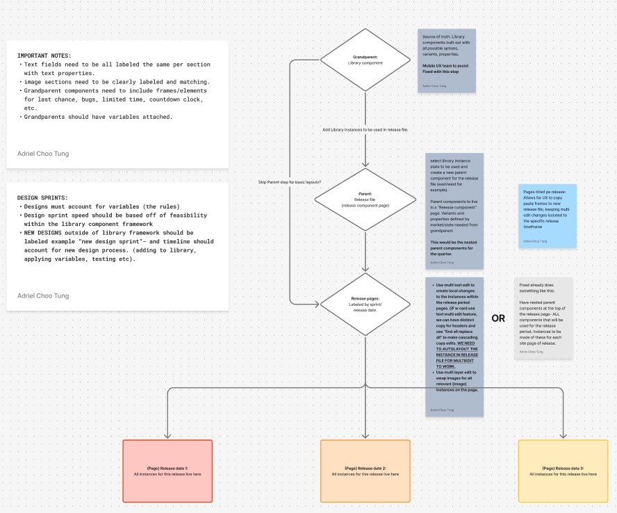
I established a new Quarterly Release Model — decoupling the Parent Component Library into its own dedicated file and presenting the new implementation method to Marketing and Product, ensuring they understood how to leverage separate design and delivery files.
During peak release seasons — iPhone and Samsung launches — the library lacked multi-edit functionality. Updating duplicate content across dozens of pages became a bottleneck that drained designer resources at the worst possible moment.
I transitioned the library to a Variable-Driven and Nested Component Architecture. By implementing a multi-stage nesting approach, I enabled "Single-Source" editing — where a content update in one module propagates across all sprint pages — significantly reducing manual labor and human error during high-stakes launches.
While a style guide existed, the lack of formal documentation led to interpretation errors during handoffs. Developers were making judgment calls that should have been resolved in design.
I leveraged Figma Variables to hard-code style standards into the components themselves. This "Design as Code" approach ensured that brand standards were baked into the system, paving the way for alignment with Fixed Business design tokens and eventual AEM integration.
By 2025, the existing variable system had reached its structural limit. Collections were fragmented, aliases pointed to non-existent primitives, token naming was inconsistent across the file, and there was no semantic alias layer. The system had no viable path to multi-LOB theming, dark mode, or AI integration. The next evolution required a ground-up rebuild — not a patch.
I audited all variable collections, documented 22 critical issues across broken aliases, structural conflicts, and missing token groups, then designed a three-tier architecture from scratch — modeled after production design systems at Radix UI, Atlassian, and GitHub Primer.
Three Tiers.
One Source of Truth.
The DDL rebuild is structured around a strict three-tier token architecture. Each tier has a single responsibility. Nothing skips a layer. The chain is unbreakable by design — change a value at any tier and it cascades correctly to everything above it.
Raw values with no semantic meaning. Color hex values, font sizes, spacing steps, radius, z-index, opacity. 175 variables. Never applied directly to components.
Intent and role. Colors, Typography, Brand — all aliasing into Primitives, all carrying meaning. This is where dark mode and multi-LOB theming happen. Change a value here and it cascades everywhere.
Component-specific tokens that alias into the semantic layer. Zero hardcoded values anywhere in the chain. Every property traces back to a named Primitive through exactly two alias hops.
button/primary/bg → accent/bg/default → brand-theme/accent/bg/default → color/orange/500 → #F66608
No component in the library touches a hex value directly. The token chain is
the single point of change for every visual decision in the system.
10 Collections.
295+ Tokens.
36 Text Styles.
The complete Digital Design Library rebuild covered every layer of the system — from raw primitives to semantic aliases to component tokens to documentation. Every collection was deleted and rebuilt from scratch following the three-tier architecture.
Naming follows the role/prominence/state pattern from Radix and Atlassian. Six groups: neutral, brand, accent, interactive, feedback, scrim. Each token describes intent — accent/bg/hover, feedback/negative/border — never a raw color name.
Three breakpoint modes: Desktop, Tablet, Mobile. Display-1 scales from 90px to 50px. Body and UI text flat across breakpoints. 36 text styles — each bound to Typography variables. Switching a frame's mode updates all text layers automatically.
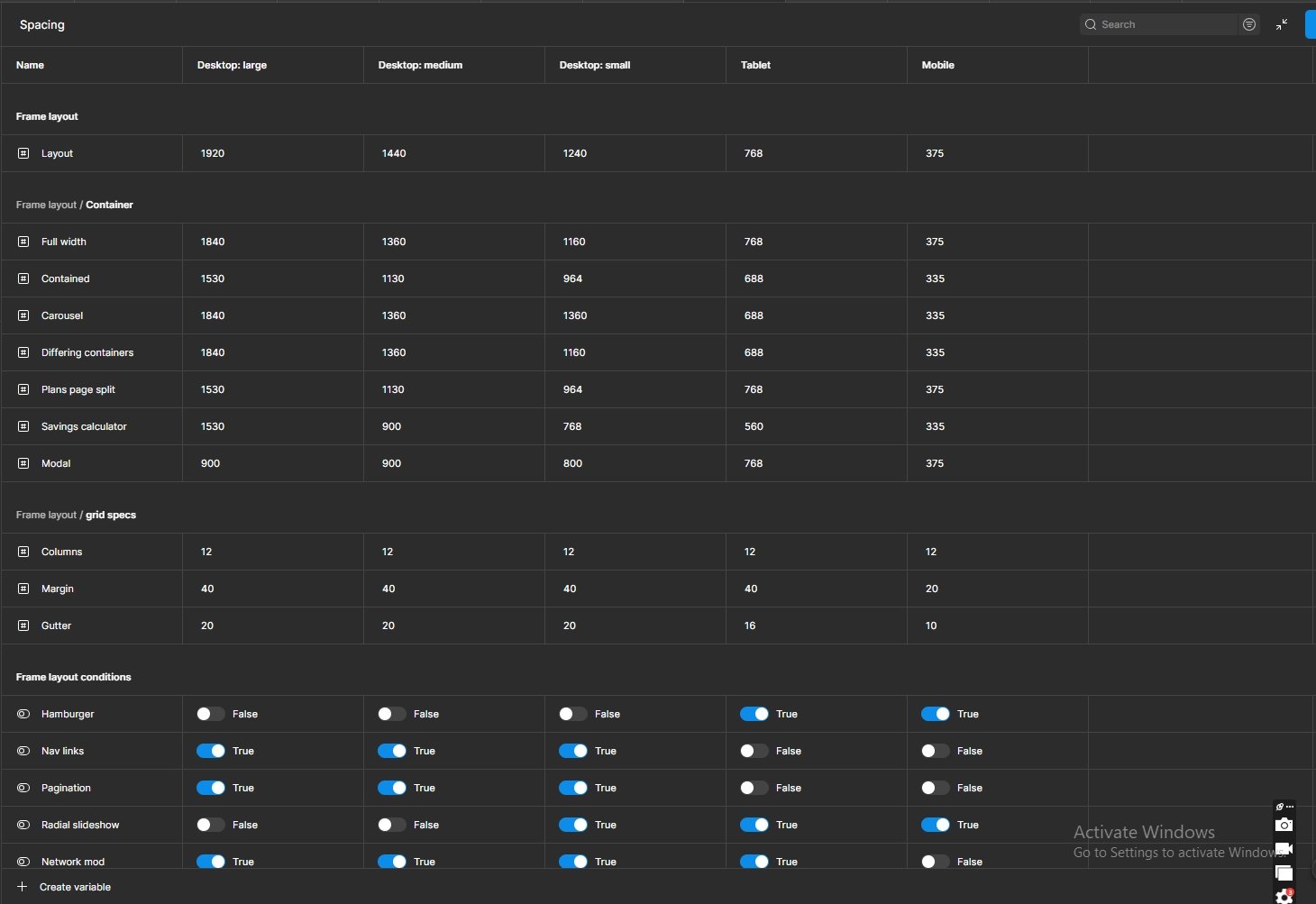
Named containers (full, wide, default, narrow, content) per breakpoint, plus seven percentage groups (20%–80%) per named container — each calculated relative to its parent, making proportional split layouts mathematically accurate across all five breakpoints.
74 component-specific tokens covering Button, Card, Input, Badge, Nav, Modal, Toast, and Table. Every fill, stroke, radius, and spacing value in the component library resolves through the full three-tier chain — no exceptions.
One System.
Three Brands.
Zero Duplication.
The Brand collection is the architectural mechanism that makes universal components possible across Fixed Internet, Mobile, and B2B. It follows the same pattern as IBM Carbon's theme system and Microsoft Fluent's brand ramp approach.
Accent resolves to orange — #F66608. The primary CTA and conversion color for optimum.com across homepage, buyflow, and account surfaces.
Accent resolves to blue — #2760F0. Differentiates the Mobile product line while inheriting the full Universal Component Library unchanged.
Accent resolves to navy — #002864. The B2B product inherits the complete system from day one — no rebuild, no new library, one mode toggle.
Universal components bind to Component/* tokens. Component tokens alias into Colors/accent/*. Colors aliases into Brand/brand-theme/accent/*. Brand has three modes — Internet, Mobile, B2B — each pointing to a different primitive palette. Switching the Brand collection mode on a frame switches every CTA, accent background, and interactive state across every component in scope. No duplication. No per-LOB variants. One mode toggle.
Token Architecture
as AI Infrastructure.
The token system was designed from the start to be machine-readable. Semantic names like accent/bg/default and neutral/fg/placeholder carry intent, not just values — giving AI tools a grammar to reason from and generate against.
I integrated Cursor with the Figma MCP to enable AI-assisted component generation directly inside the design file. Components can be prompted, generated, and validated against the token system in a single workflow — without leaving Figma.
I authored a comprehensive Cursor prompt specifying the full token chain, all 16 universal components, layer naming conventions, Auto Layout requirements, component property standards, and multi-LOB compatibility rules. Output is token-wired, production-ready Figma components — not rough approximations.
Button, Input Field, Card, Badge, Navigation, Modal, Toast, Alert Banner, Table, Select, Checkbox, Radio, Tooltip, Avatar, Icon Button, Divider — all built with Auto Layout, variable bindings, and complete component properties across all states. All cross-LOB compatible via the Brand mode toggle.
Because token names carry semantic intent, AI can validate that components follow the system — flagging hardcoded values, incorrect token references, and state gaps the same way spell-check flags typos. This closes the QA loop at the design layer before anything reaches production.
Most AI design tools generate output that's visually close but not on-brand — because they have no structured design context to work from. The DDL's three-tier token architecture gives AI a machine-readable rulebook. The result is components that are correct by default, not correct by coincidence.
Variable-Driven.
AEM-Ready.
The variable system was built in parallel with a formal documentation layer — six HTML documentation pages imported into Figma via Builder.io, covering the Color System, Typography, Container, Layout, Spacing, and Getting Started guides. Variable descriptions written directly into each token provide inline context while designing.
Standardized module variants and breakpoints to automate layout shifts across all Optimum properties — 1920, 1440, 1240, 768, and 375. Typography, container widths, grid gutters, and section spacing all switch automatically per breakpoint mode.
Leveraged Figma's Multi-Edit capabilities. Updating one "Parent" instance in a release file swaps promo offers across an entire month's worth of screens instantly.
Token names are designed to map 1:1 to CSS custom properties — the same naming convention in the design system becomes the variable name in code. This eliminates the "design QA" translation layer between design and engineering entirely.
Built a five-slide executive presentation in Optimum brand colors covering the business case, three-phase roadmap, AI integration strategy, stakeholder impact across all LOBs, and the testing and validation approach — written for a non-technical VP audience.
Scaling the
Blueprint.
The success of the Mobile library created a mandate. In late 2025, I took on the Fixed Internet and B2B streams — tasked with bringing the same operational excellence to multiple separate business units under one unified system.
Mentorship: I guided the Fixed Business designer in establishing their foundational library, ensuring they adopted the same responsive and variable-backed logic established for Mobile — and that their work plugged directly into the universal token chain.
Team Governance: I lead a team of three designers, serving as the final design authority — ensuring cross-platform consistency across Fixed, Mobile, and B2B while managing an external vendor relationship.
By mapping Figma variables to the AEM technical roadmap, I've synchronized current design output with our future platform. The Brand collection's three-mode architecture means the B2B product line can inherit the complete design system the moment it's needed — without a rebuild, without a new file, without starting over.
Design to
Production.
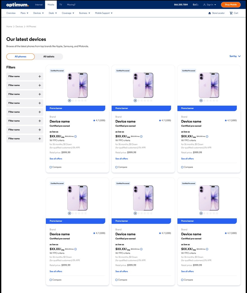
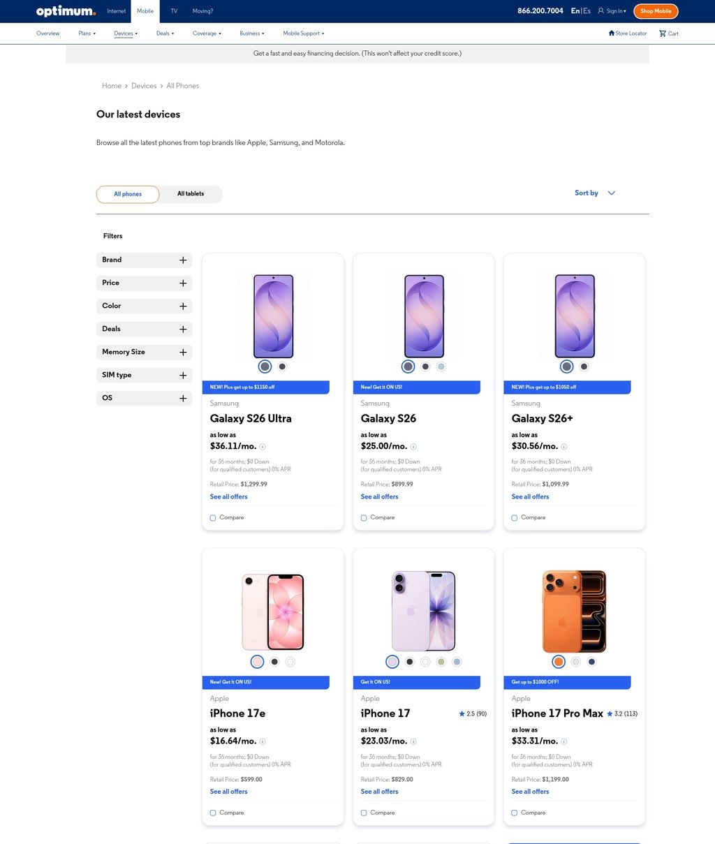
The Optimum Devices gridwall redesign is one example of how this system operates end-to-end: designed in Figma using the variable-backed component library, handed off with exact specs, and shipped with high fidelity to the live site.
From Solo Mission
to Design Operation.
What started as a solo effort to fix a broken handoff process has evolved into a high-velocity design operation — and a production-ready, AI-enabled design system — supporting three lines of business.
built from scratch
architecture
across 10 collections
bound to variables
one mode toggle
Fixed + Mobile
parity with AEM
for machine readability
The system is no longer a Figma file that requires a designer to interpret. It is a structured, documented, machine-readable design language — built to onboard new designers, generate components with AI tooling, theme across three lines of business with a single mode toggle, and scale to every surface Optimum builds on.
Every component built today is a plug-and-play asset for tomorrow — turning the design system into a true product that enables the team to ship faster, with significantly higher technical accuracy, and without starting over every time the business grows.